🧵 View Thread
🧵 Thread (9 tweets)

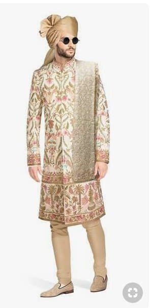
i'm always amused when professional fashion designers seem to make bad choices bad: looking like a walking tin of powdered perfume good: contrast between print and fabric https://t.co/PnvyQyNrqM
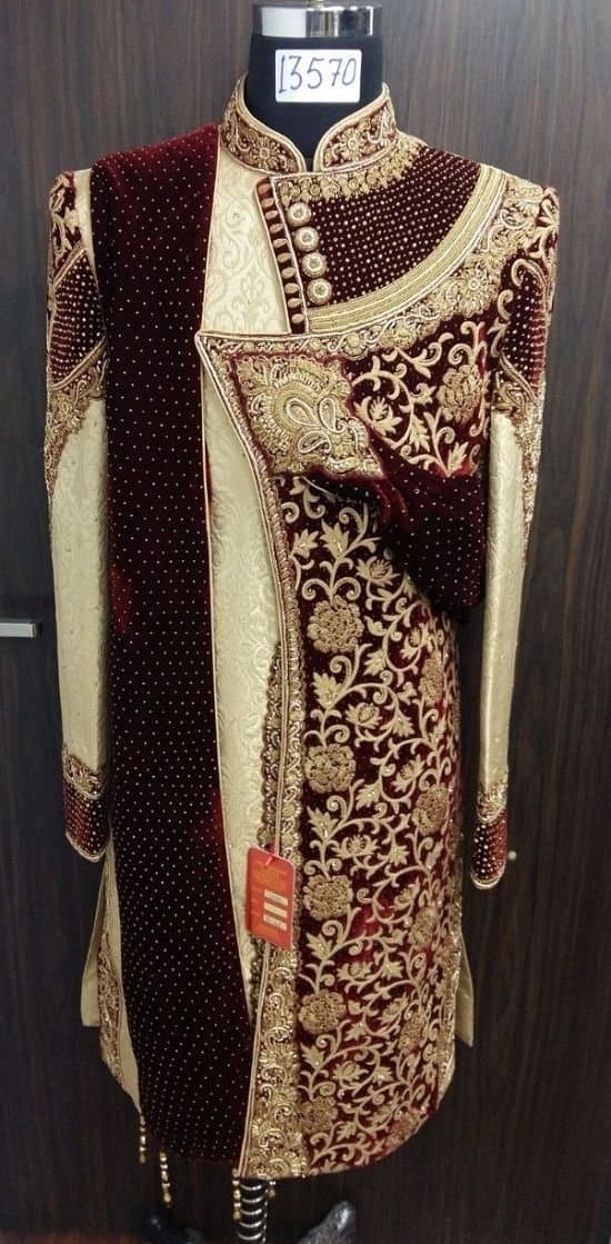
bad: bizzaro orgy of carpets and cushions good: basic principles of contrast, again https://t.co/QbG9VWnMGO
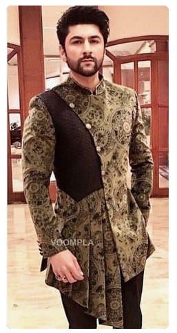
bad: making adding incoherently random cuts, patches and frills to look 'trendy' good: pick *one* gimmick and stick to it (I personally think this 'asymmetrical cuts' trend is 95% trash, but if you're going to do it...) https://t.co/fifwGkwRqr
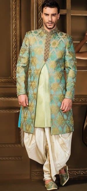
bad: looking like a giant turquoise vagina good: just using a nice print with a good fit and no weird random cuts here and there for no damn reason https://t.co/E9JV0iOjUu
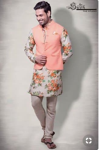
bad: a weird-ass millennial pink lifejacket over your floral print good: if you have the balls to wear flowers, wear the damn flowers. no cowardly half measures https://t.co/PA3hyTxlmN
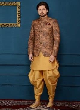
bad: what's with the "oops we ran out of print" on the top look? and the pants being the same color? who let you get photographed like this? 😂 i'm sorry good: same guy in a better situation. could probably do with more fitted pants, in a different shade https://t.co/wZITOKdUBU
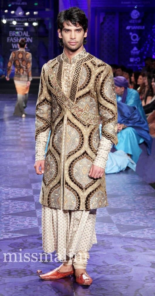
bad: this is what happens when you think you're being ambitious but you can't decide on what you're trying to do. why the mini-sash? why the complicated collar(s)? where are we supposed to look? good: see, complicated and elaborate can work. you need visual hierarchy still https://t.co/1FMlnvdR9c
goals https://t.co/Bd5YOcFfPo